UPDATE: Jeb Bush officially entered the race today. We have added his logo in our rankings.
A presidential campaign adopting an official logo is a somewhat recent phenomenon. But after President Obama's 2008 logo became an iconic image which no one will ever be able to forget, campaigns now see logos as a way to make their brands instantly recognizable.
It's unclear who actually comes up with the designs for these logos. Some candidates probably have a team of marketing executives. Others might just draw theirs in crayon or tape it together using construction paper. Either way, it's a pretty big decision and the candidates almost certainly have the final say in what logo they want to be represented by.
So far, 15 candidates have made their presidential bids official and unveiled their respective logos. Here is how MRCTV ranks them, starting from the worst and ending with the best.
NOTE: Political ideology or party affiliation was not taken into consideration for this ranking.
15. Rick Perry
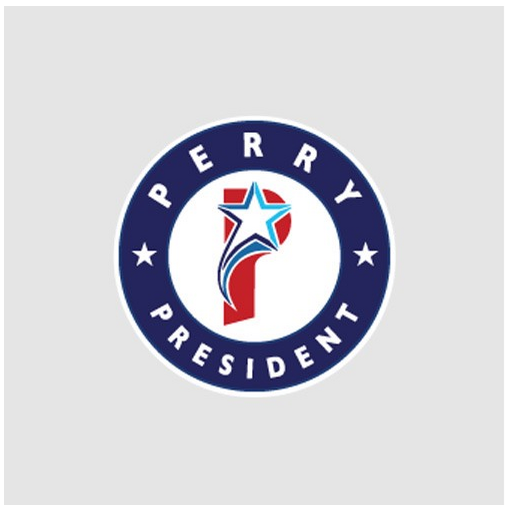
Rick Perry is the latest entrant into the 2016 presidential foray. Unfortunately, his logo looks more like he's running to become a uniform designer for a baseball team.
The "P" is obscured by a shooting star which, while whimsical, doesn't really convey the tough-as-nails cowboy image that Perry has adopted over the years.
Then again, baseball is "America's Favorite Pastime."
14. Hillary Clinton
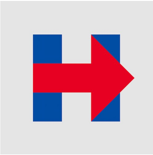
What can be said about Hillary Clinton's logo that hasn't already been said before? It looks like it was made by a kindergartner using safety scissors and magic markers.
The logo appears to be giving people directions to a hospital of some sort, which might be a subtle warning as to how the healthcare system will function if Mrs. Clinton gets elected.
It stands out like a sore thumb when compared to the other logos on this list - but maybe that's exactly what Hillary was going for.
13. Lincoln Chafee
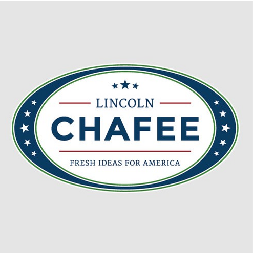
If you're a candidate with almost zero name recognition, you need something that is going to introduce you to the general public in a way that distinguishes you from the rest of the field. You need a fresh idea!
Unfortunately for Lincoln Chafee, his campaign slogan "Fresh Ideas For America" is the opposite of that.
If a candidate can't even come up with a fresh idea for a bumper sticker slogan, then what are the chances that he's going to bring fresh ideas to his campaign?
Also, never use green in your logo. The colors are red, white and blue. Those are the rules. It's almost as if Chafee is unclear as to what country he wants to be the president of.
If Chafee wanted to grab people's attention, his logo would simply say "LINCOLN 2016." While it may confuse people into thinking that America's greatest president has returned from the dead to bring the nation back from troubling times, if people see it enough, they may start to wonder who this mysterious new "Lincoln" character is. "Chafee?" Not so much.
12. Rand Paul

First of all, black is not the color that you want to use if you're trying to instill hope in people. It's the color you use when someone dies.
To be fair, there's another iteration of this logo with a white background, but this is the one that's featured on his website.
The liberty torch is bland and the block lettering is a bit intimidating. It almost looks like a teaser poster for an action film. But the title character of the film is clearly not someone you want to mess with. He shoots drones out of the sky and destroys the NSA with a bazooka, leaving destruction and chaos in his wake. Bold? Absolutely. Presidential? Not at all.
11. Carly Fiorina
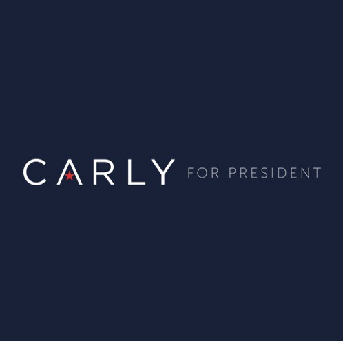
Not as "bad" as it is dull.
This logo looks like Fiorina chose her template from a 90's perfume ad. Also, is it just me or is the "for president" part of the logo a bit dim? That's kind of important.
Once again, if you're running for the nation's highest office and you have very low name recognition, it's kind of important to make the office that you're running for blatantly obvious.
Don't get me wrong. It's a good looking logo for a clothing line, but not for a White House run.
10. Mike Huckabee
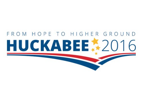
There's actually a lot going on in "Huck's" logo but you really have to be a political insider to understand it.
Huckabee is from the town of Hope, Arkansas, but the word "hope" in the slogan is a subtle jab at the "hope" that president Obama promised us all in 2008. It's clever. But there's just too much going on, in my opinion.
A long slogan that makes you think. Stars flying everywhere, multiple stripes, name in big bold letters... This is the type of logo that leads to car accidents when people drive by a yard sign or see it on a bumper sticker.
9. Lindsay Graham
Not terrible. But not great. Just kind of blah. Some might say it's the perfect logo for him.
8. George Pataki

Pataki got at least one thing right in his logo. His name is front and center. It's an odd name and super fun to say. This logo throws that right in your face.
If your kids see this logo on the back of someone's car, you're going to have pull over in order to stop them from yelling "Pataki, Pataki" the whole way home.
It has kind of a weird flag icon. It's almost as if the guy who was making the logo got distracted and didn't finish. So if you see a guy running through the halls of George's campaign headquarters screaming "Pataki" over and over again at the top of his lungs, tell him to get back to work and finish the damned logo.
7. Ben Carson
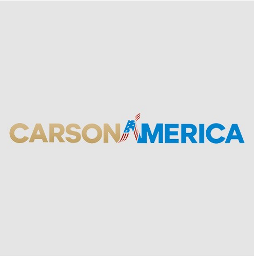
Carson's logo is very slick. While red, white and blue are the standard colors for campaign logos, if you can fit some gold in there, by all means, go for it. Gold says prosperity and it distinguishes it from other logos in a nice way that isn't too grating.
Once again, however, Dr. Ben Carson is one of those candidates with very low national name recognition, so there's the possibility that the logo will leave people wondering who this "Carson America" guy is and why they don't see the name on their primary ballot.
6. Jeb Bush
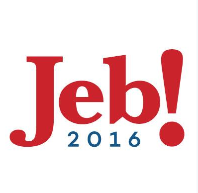
If people get as excited about Jeb Bush's campaign as his logo seems to be then he could do very well. Still I can't help but think he stole this idea from somewhere else.
Do choosey moms choose Jeb? Guess we'll find out soon.
5. Rick Santorum
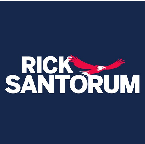
Santorum's campaign emblem is totally bad ass. It's just his name with a bald eagle flying off toward an America with a brighter future.
If Chuck Norris ever ran for president, I'd imagine his campaign logo would look something like this. Except Chuck Norris wouldn't need a logo. He'd win every state simply by staring silently into the television camera on the night of the first debate.
4. Martin O'Malley

Very original concept. This logo literally makes a statement. That gap in the lower left hand corner of the rectangle is a speech bubble. Get it?
This logo wants to start a conversation with you about why you shouldn't vote for Hillary Clinton. It will probably also be the logo for Martin O'Malley's talk show on cable news after this election cycle ends.
3. Marco Rubio
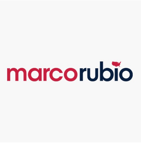
Presidential logos are designed to market a product. It just so happens that the product in question wants to run the country.
Rubio's logo is like an ad for an upscale yet affordable national chain of restaurants. The lowercase letters are not as in your face as the other candidates' designs, but still bold enough to catch the eye. This is a great strategy. If people are going to be looking at your name everyday for the next year, they don't want it to seem like the logo is shouting, at them, accusing them of hating America if they don't vote for you.
Rubio's logo comes across as a polite suggestion, rather than a hyper-patriotic, tassel-filled campaign rally.
Then there's the kicker.
The image of the United States replacing the dot on the "i" is a subtle yet clever reminder as to what all of this campaign fanfare is really all about.
2. Bernie Sanders
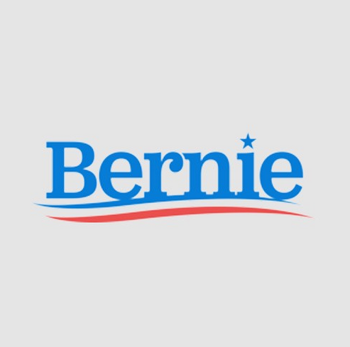
Bernie Sanders' logo isn't clever or bold or loud or artistic. But it's effective.
"Bernie."
You know Bernie. He's a great guy! He lives down the street. You're on a first name basis with Bernie. He picks up your mail when you're on vacation. Also, he's the only guy named "Bernie" that you've ever met.
Alternative candidates like Sanders need an advertisement as simple as possible to distract people from the fact that their ideas are totally out of the mainstream.
This logo also has throwback appeal. It looks like it could have been the logo for a candidate in the 1970's before Americans got all fancy with crazy fonts and Photoshop.
If you didn't know any better, after looking at this logo, you would probably conclude that "Bernie" is the most normal guy in this whole race.
1. Ted Cruz
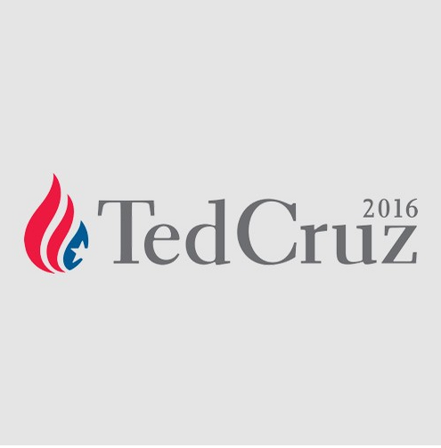
The Cruz logo may not be the most bold or creative of the group, but that's what makes it the best. The flame perfectly encapsulates the passion that the candidate exudes in his speeches. And unlike any of the other logos - with the exception of Hillary's - if Cruz's candidacy catches fire, no pun intended, the flame will be able to stand on it's own without the candidate's name being necessary for passersby to understand what it represents.
Some of the candidates above tried way too hard to be fancy or artistic with their campaign symbols. The result is a logo that conveys a lack of seriousness or distracts from the fact that the individual it's representing is running for the nation's highest and most prestigious office.